Become More
Campaign for the future of Holy Cross
College of the Holy Cross engaged OHO Interactive to create a micro-site for the most ambitious campaign in the history of the college. Their goal was to raise $400 million dollars over the course of seven years. The purpose of the site was to communicate the campaign goals and six major priorities, as well as garner recognition for Holy Cross as one of the premier Catholic liberal arts colleges in the nation.
CLIENT
The College of the Holy Cross is a private, undergraduate, Roman Catholic, Jesuit liberal arts college in Worcester, Massachusetts.
OHO INTERACTIVE TEAM
UX/Visual Designer (my role), Creative Director, Director of Development, UI Developer, Drupal Developer, Senior QA Analyst, Senior Project Manager, Associate Creative Director - Digital Strategy
Wireframes
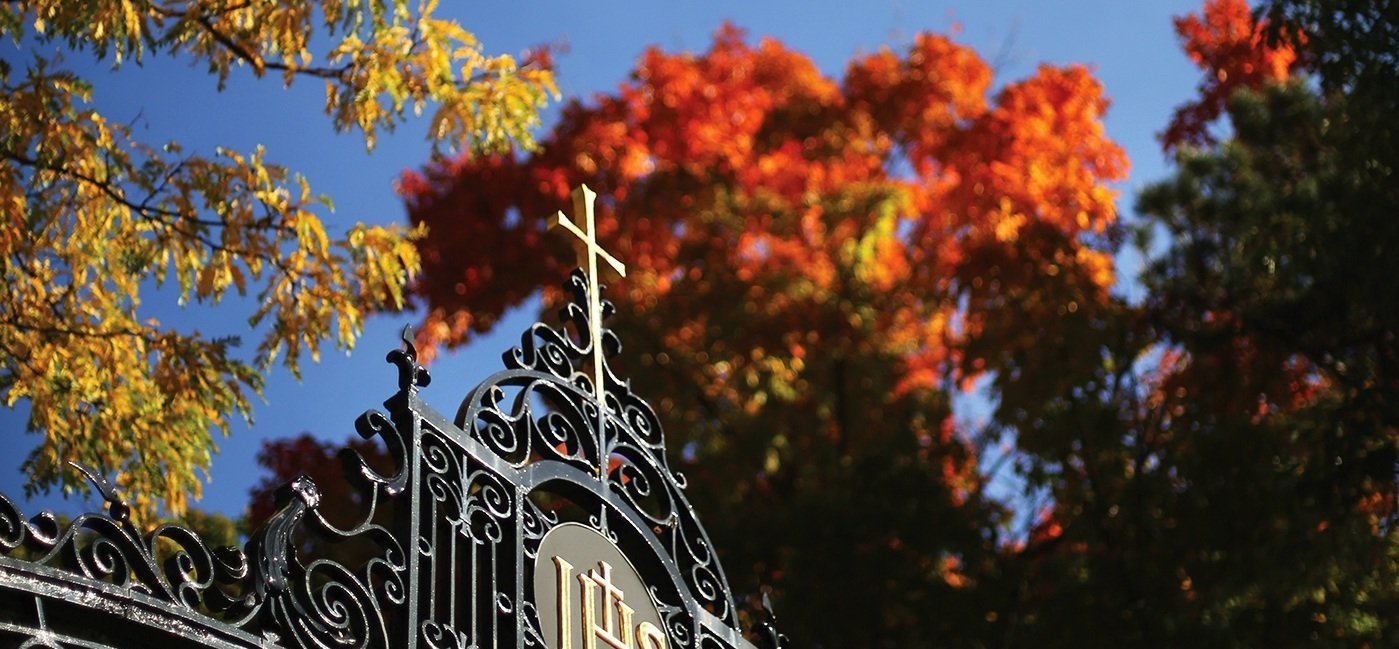
Holy Cross wanted a simple, elegant design with immersive imagery and data rich infographics that would intrigue users and encourage them to learn about the campaign’s projects and priorities.
Our Solution
The Become More micro-site needed to clearly communicate the mission and vision of Holy Cross along with detailed campaign information in a digestible and visually appealing way. We wanted to keep users coming back to the site regularly for updates, so the content had to feel fresh over the course of the seven year campaign.
To accomplish these goals, we highlighted the progress of campaign initiatives through media rich news stories and project updates throughout the site. Student, faculty, and alumni impact stories are tied into the campaign priority page to create a feeling of connection between potential donors and the Holy Cross community. And the homepage slider was used to showcase ambitious building projects that would be completed at the end of a successful campaign.
UX ACTIVITIES & DELIVERABLES
Stakeholder Interviews
Competitor Research
Wireframes
Clickable Prototype
Functional Specification
Visual Design
Visual Designs
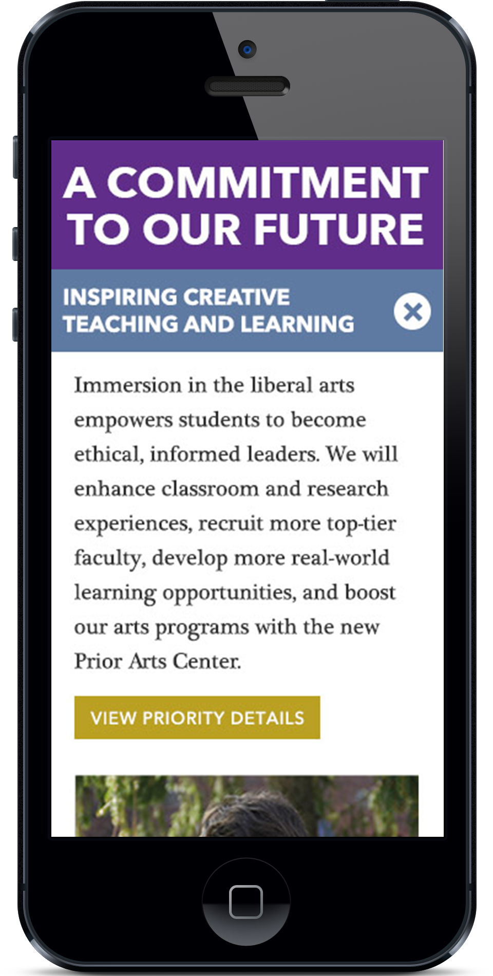
The micro-site was designed to complement the look and feel of Holy Cross’s new website while creating a distinct visual identity for the Become More campaign. Rich imagery alternated with stark white backgrounds and bold typography help to convey campaign priorities in a visually interesting way.


The Result
The Become More campaign raised $420 million dollars from 2013 to 2020, $20 million more than their goal. The micro-site was a fully responsive and visually rich experience that encouraged users to explore and connect with Holy Cross through it’s history, mission, and vision for the future.


